Experiencing Colour
It was back in 2017 that I worked through Betty Edward’s book called ‘Color’ and 2018 when I wrote the accompanying account of my experience. As I sit here in 2023, reviewing what was initially and long cumbersome piece of writing, I am struck by how much my life has moved on in the interim: a change of career direction, a change in life circumstances, losses and gains, and a host of experiences the majority of which are welcome and were unforeseen in 2018. Yet I am also struck by how many things have not changed and fundamental issues about my art and creativity remain unaddressed. One such issue concerns my feelings towards colour. But I did make inroads into my use of colour and receive valuable insights, which I’ll attempt to detail below.
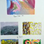
In her introduction to one of the first exercises, Betty writes, “Part of the joy of painting lies I finding out how you feel about color. Each of us has color preferences that are rooted in personal experience, physiology, and psychology. The following exercises…will help you learn where your preferences lie.” The truth is, I have never experienced this aspect of ‘the joy of painting’. I was not confident with my likes or dislikes at the time, was very dissatisfied with the results of the task she set, and is not something with which I have made much forward progress since. I felt that I had, and still have, a real ‘artistic, emotional, spiritual block’ using colour. And am only recently discovering the reasons why.
Betty promised that “these small paintings [would be] a first step in a long process of self-discovery through color that you will experience as you acquire knowledge about the amazing world of color. As in all artwork, the goal is to find yourself – your style in color, your expression, and your unique sensibility. You have made a first statement.” I didn’t feel I had. So, a long journey beckoned… I just didn’t realise how long that journey would be.
Colour harmony
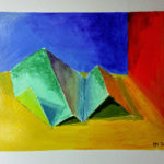
Despite my struggles regarding colour preference, I nevertheless enjoyed the other exercises in the book. There was a similar sense of accomplishment on their completion, as with the tasks in her drawing course. I mixed colour wheels, learnt about hue, value and intensity and applied them to the issue of colour harmony in a painting. But I didn’t really understand, let alone ‘feel’, the harmony. It just highlighted to me that although I had reasonably good ‘graphic’ skills, there was a colour literacy that I just didn’t have.
This wasn’t only evident in the art I produced, but in my appreciation of art in general. I looked at Kandinsky’s ‘compositions’ in exhibitions, read about the harmony in the accompanying notes. But I couldn’t identify the harmony, I couldn’t hear the music in it. Even though I quite like looking at Kandinskys, I don’t see what he is trying to do. I had a similar experience when visiting a Patrick Heron Exhibition. I liked many of the pictures, acknowledged the references in the accompanying notes about how he balanced form and colour, but I just couldn’t see them manifested in the pictures themselves.
Similarly, I could never myself quite enter into the hallowed trance-like state many admirers of Rothko inhabit when they stand before his colour-field paintings. The most profound experience I had of a Rothko painting was in Tate Modern when a young woman stood right in front of a painting I was contemplating, looking at another on an adjacent wall. Against the back-drop of the Rothko, I contemplated her figure, her snuggly fitting grey halter top, her bronzed shoulders and face, her black eyeliner and clear eyes, the glistening of a necklace, her dark hair tightly pulled-back in a pony tail. And then I looked beyond to the Rothko, and had a sense of boundary, of liminal threshold, I felt a sense of mystery in the painting, of the unknown, of my own smallness, of my own limitation in the face of the limitless – what I had read about what Rothko pictures and their play of colour create for his devotees, but I had never experienced. It is as though I needed the figurative, the corporeal, the human, to launch me beyond the human, to connect me with what is beyond me. Much like a child who needs pictures in a book to make the text and the literary imagery come alive, I still rely on that corporeal experience even today.
Pictorial colour
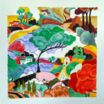
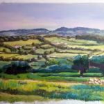
My use of colour in my own art remains quite limited, or maybe it’s natural or instinctive, but it certainly is not planned. However there was one more lesson which Betty Edwards had to teach me, and it was through the activity of adding what she called pictorial colour to a picture. It was less the artistic lesson which stuck with me, but the lesson about life.
She said that we imagine an orange (fruit) to be orange (colour); when we look at it we think that it in some way possesses this local colour – i.e. orange. We often miss that our perception of the fruit is actually multi-coloured, full of greens, browns, reds, yellows and whites, depending on how light is falling and what it lies next to. This perceptual colour should of course be attended to. However, the picture needs an additional passing of pictorial colour. Pictorial colour is that colour you add to a picture, which is in no sense ‘there’, in order to bring the picture into balance and harmony. This is important, Betty says, because “your painting will exist long after the still life has been dismantled or the model has relinquished the pose.” The most important thing about your picture, therefore, is not what it represents – even if it is figurative – it is the picture itself which is the thing of value, the thing that ‘exists’.
From Betty Edwards’ ideas on portraiture, a portrait is not merely a representation of the person, but your view of them, in fact you often mix up yourself in the portrait. As she says, “the more accurately you draw the person, the more clearly you show you.” Thus in portraiture, similarly, you have added is something which, strictly, isn’t actually there. And this is the same with life. When we look at a person, we don’t see them as they are, what we see is a mixture of us and them, our perception of them lies somewhere between where they are and where we are.
I think we naturally make connections, add things ‘which, strictly, aren’t actually there’ into our relationships with people, into the events of our lives; we bring meaning to situations, in order to bring harmony, balance and meaning to the whole. In short, we add pictorial colour to life, for better or worse. This ‘construction’ could be seen to be moving into the realm of fantasy, of dreams, of unreality, suggesting the need for a ‘reality check’ – to reduce, separate, break things down into constituent parts in order to see things as they really are, in order to see ‘the truth’. Art, specifically painting, according to Plato, was always the poorest path in the pursuits of knowledge and truth, because by its very nature it is mimetic, and poorly mimetic and that.
However, this process of deconstruction is like trying to get back to the model in the portrait, or the actual objects in the still life arrangement, and misses the true value which is the picture itself and what it brings to the world. Perhaps the reality is that truth is fragile – the real, important truth is that truth is surreal, truth is a layer ‘added on to reality’, i.e. truth and meaning breathe through the immediate, in the same way that pictorial colour is added on to perceptual colour to bring harmony to the whole. Despite, the inherent problems this view of searching for truth and meaning brings, I consider it to be both natural and necessary.
Working through Betty Edwards’ book Color certainly began this process of cherishing, trusting and valuing my own perceptions, and enhanced the meaning and value of the events and relationships my life contains, if it didn’t actually enhance my confident use of colour very much. It may bear fruit in the future. That is the hope anyway.


